Us
Brand guide
Hi there, welcome to the Us Brand Guidelines! This brand guide serves as a comprehensive guide to ensure consistency in our visual and verbal identity across all platforms. Here, you will find everything you need to maintain the integrity of the Us brand, including our brand essence, visual elements like colors, typography & imagery and how to use them. Documents like the lasted version of our slide decks and so much more.
This document is intended to help you create brand-aligned content while allowing space for creativity within our framework. If in doubt, always consult an Us designer for guidance and approval.

What – Vision
We want to become the trusted partner that businesses turn to for bold, forward-thinking solutions, where collaboration fuels innovation and shared success.
How – Mission
By offering innovative branding, data-driven digital marketing, and AI-enhanced strategies, we co-create impactful solutions that drive growth and empower our clients to stay ahead in a rapidly evolving world.
Why – Purpose
Because we believe that meaningful connections and collective creativity drive progress, we strive to empower businesses to reach their full potential and make a lasting impact.
Our story
According to statistics, the average working person spends roughly 90,000 hours of their life at work. That’s thousands of hours spent side by side with people we might never have met otherwise, sharing goals, challenges, and the occasional coffee break. Yet, there is no formula that predicts why some teams thrive, why one brainstorm unlocks brilliance, or why a shared mission can turn colleagues into a collective force of change. If there is, the numbers haven’t cracked it for us yet.
What we do know is this: the working world isn’t just about clocking in or ticking boxes. It’s where strangers come together to create, problem-solve, and build something greater than themselves. It’s where ideas collide and collaboration thrives. It’s where the sparks of innovation are born, not in isolation but in connection.

And at the heart of all this is a truth that drives everything we do: Work isn’t just about getting things done. It’s about the people who make it possible. It’s about elevating every contribution, nurturing every voice, and believing that when individuals work together, they can create something extraordinary.
That’s why we’re here. To make those 90,000 hours matter— not just for what we accomplish, but to empower and be empowered.
At Us, teaming up is at the core of what we do. Co-creation is how we build trust, respect, and lasting partnerships. We care genuinely, face challenges head-on, and focus on finding solutions. Rather than claiming to be the best, we stand tall by giving our all. Success is built on mutual respect—between ourselves, our clients, and our work. We remain approachable and grounded, focused on delivering great results while having fun along the way. We are Us. Together, we create. Together, we grow.
- Creative and informed: We value creativity but ensure smart decisions. Creativity is backed by data and knowledge.
- Supportive: We listen, offer support, and build trust through open communication, fostering collaboration.
- Confident yet humble: We are skilled and take pride in our work but don’t boast results we can’t back with facts.
- Resilient: When faced with setbacks, we learn and adapt, demonstrating a positive and solution-oriented mindset.
- Relatable: We are approachable, professional, and trustworthy, making clients feel confident in working with us.
Us is like the confident, creative, and supportive colleague who lifts everyone around them. They combine knowledge with creativity, listen actively, and provide thoughtful solutions. Their communication is straightforward, building trust without exaggeration.
What we are not:
- Ego-driven
- Risk-averse
- Confrontation-averse
- Dismissive
- Resistant to learning
- Dramatic or exaggerated
- Lacking integrity
Primary: Retail B2C & E-commerce (Core competence, declining business)
Needs: Optimize customer journey, improve retention, enhance UX/UI, and CRO. Ambitions: Strengthen brand loyalty, drive profitability, leverage first-party data. Pains: Rising acquisition costs, fragmented data, high cart abandonment. Gains: Increased LTV, streamlined campaigns, higher conversion rates.
Secondary: Manufacturers, B2B2C, D2C (Growing business)
Needs: Transition to D2C, utilize first-party data, scalable marketing strategies. Ambitions: Build a recognizable consumer brand, align digital touchpoints. Pains: Managing B2B and D2C channels, lack of digital expertise. Gains: Higher margins, direct customer insights, improved marketing agility.
Tertiary: Government (Stable business)
Needs: Digital transformation, modernized citizen engagement. Ambitions: Transparent public services, stronger citizen connections. Pains: Bureaucratic challenges, slow digital adoption. Gains: Improved citizen satisfaction, efficient workflows.
- Exclusive Partnerships: Access to top-tier, industry-leading tools.
- Certified Expertise: Our team holds certifications in essential platforms.
- Continuous Training: Staying ahead with regular training and workshops.
- AI-Driven Solutions: Integrating AI for smarter marketing.
- Proven Track Record: Case studies showcasing our impact.
- Integrated Approach: Branding, data, UX/UI, and automation seamlessly aligned.
- Junior Development Program: Structured training for new talent.
- ROI Calculations: Data-driven proof of results.
- Interim Support: Temporary consultants ensure seamless service continuity.
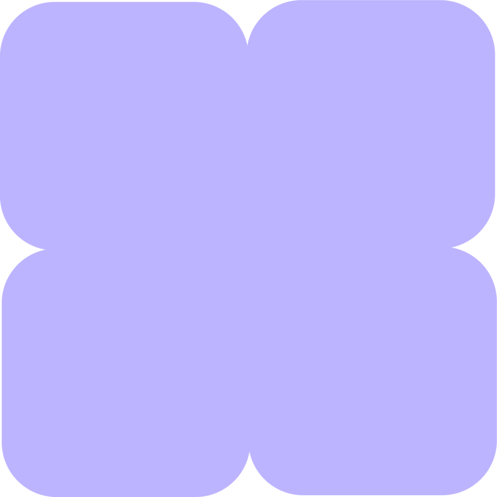
Logo
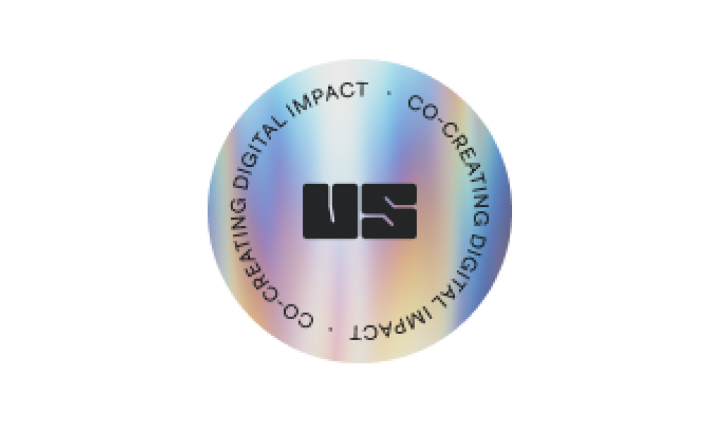
Seemingly simple but well thought out. The Us logo is composed of two squares with rounded corners of equal size from which the U and S were created. Two equally sized parts with a nod to the marriage of two companies joining forces to create impact together with clients. On a practical note: the logo has black, white and gray versions. Both for the filled and the outlined version. In almost every case we use the filled logo. We also made a version with a holographic border. This version works best as a gif to really get the holographic effect.
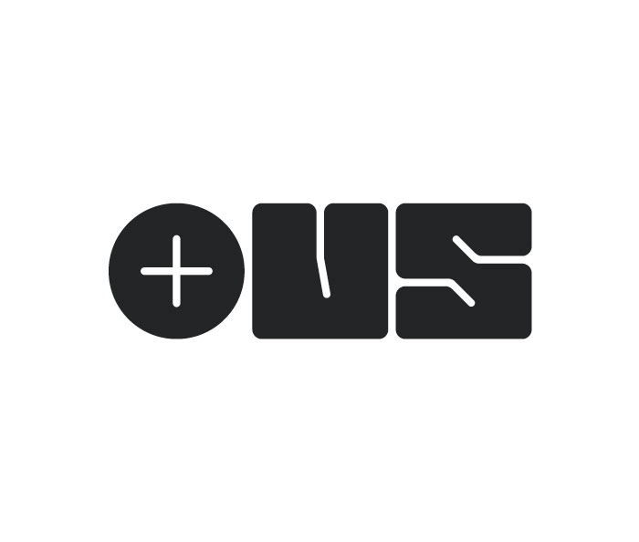
In addition, we also created a version with a plus to highlight the our goal to create meaningful connections and to co-create with our clients. We use this logo to indicate our partnerships with clients and clients. Together, we create. Together, we grow.
Logo Animations
This logo animation is a great way to present Us as a dynamic company. Use it at the end of videos for a powerful ending, in signatures, animated socials, powerpoint presentations,… The round sticker is also a nice way to implement our logo in a less in-your-face way.
Colors
Our color palette consists of the primary colors green, purple, pink and orange, each with lighter, medium and darker variations. In addition, the palette includes beige and gray tones. A gradient is also created from the main colors of green and pink.
How to use:
- Combine light and dark variants to create a tone-on-tone effect. Do not use the medium and dark variants or use them only to a limited extent as full-face background colors and more toward text.
- We are not a playground for kids. Don’t use the main colors directly next to each other to avoid making the whole look too playful. Want to use multiple colors? Combine with the medium and dark variants, Shark or beige and gray shades.
- Make sure that your use of color website purposes are accessible and comply with the WCAG AA-standards. (contrast ratio)
Colors and services:
For all the “Impact” services (think Growth Marketing and Data Intelligence) we use green and purple. For all “Co-create” services (CXO and Creative studio) we use orange and pink.
Primary colors
Lavender
Hex
#BDB4FF
RGB
rgb(189,180,255)
CMYK
32 32 0 0
Perfume
Hex
#f3aaff
RGB
rgb(243,170,255)
CMYK
17 39 0 0
Mint Green
Hex
#8DFFB7
RGB
rgb(141,255,183)
CMYK
44 0 45 0
Rajah
Hex
#FFB985
RGB
rgb(255,185,133)
CMYK
0 35 50 0
Shark
Hex
#191A1B
RGB
rgb(25,26,27)
CMYK
78 68 60 82
Secundary colors
Base
Ecru
Hex
#F5F4E5
RGB
rgb(245,244,229)
CMYK
4 3 13 0
Spring Wood
Hex
#FCFCF8
RGB
rgb(252,252,248)
CMYK
1 0 3 0
Light
Titan White
Hex
#F2F0FF
RGB
rgb(242,240,255)
CMYK
6 7 0 0
Selago
Hex
#FBE3FF
RGB
rgb(251,227,255)
CMYK
3 15 0 0
Hint Of Green
Hex
#E6FFEF
RGB
rgb(230,255,239)
CMYK
12 0 11 0
Seashell Peach
Hex
#FFF3EB
RGB
rgb(255,243,235)
CMYK
0 7 9 0
Medium
Royal
Hex
#6257E8
RGB
rgb(98,87,232)
CMYK
79 70 0 0
Electric Violet
Hex
#B20CCC
RGB
rgb(178,12,204)
CMYK
58 84 0 0
Watercourse
Hex
#048255
RGB
rgb(4,130,85)
CMYK
86 24 78 9
Hawaiian Tan
Hex
#B35610
RGB
rgb(179,86,16)
CMYK
22 71 100 14
Dark
East Bay
Hex
#423A75
RGB
rgb(66,58,177)
CMYK
88 85 22 9
Disco
Hex
#7E1C74
RGB
rgb(126,28,116)
CMYK
61 100 13 4
Green Pea
Hex
#1E625A
RGB
rgb(30,98,90)
CMYK
84 37 59 31
Pablo
Hex
#872012
RGB
rgb(135,32,18)
CMYK
29 96 100 35
Gradients
Green – Purple gradient
Hex
RGB
CMYK
Greys
00
Hex
#FFFFFF
RGB
rgb(255,255,255)
CMYK
0 0 0 0
10
Hex
#FCFCFC
RGB
rgb(252,252,252)
CMYK
1 1 1 0
20
Hex
#F9F9F9
RGB
rgb(240,249,249)
CMYK
2 2 2 0
30
Hex
#F3F3F3
RGB
rgb(243,243,243)
CMYK
6 4 5 0
40
Hex
#EAEAEA
RGB
rgb(234,234,234)
CMYK
10 7 8 0
50
Hex
#D9D9D9
RGB
rgb(217,217,217)
CMYK
18 12 14 0
60
Hex
#A7A7A7
RGB
rgb(167,167,167)
CMYK
37 28 29 7
70
Hex
#707070
RGB
rgb(112,112,112)
CMYK
53 43 42 28
80
Hex
#494949
RGB
rgb(73,73,73)
CMYK
63 53 51 50
90
Hex
#2E2E2E
RGB
rgb(46,46,46)
CMYK
70 61 57 69
100
Hex
#000000
RGB
rgb(0,0,0)
CMYK
91 79 62 97
Typography
With only 2 fonts we shape our whole visual identity. For body text we use ‘Public Sans’, for titles, quotes, etc. we use ‘Bricolage Grotesque’. All fonts come with different weights and you can use them all. Isn’t that nice? Head-up though, our design team won’t be happy if you use many different weights in one visual. Good to know is that these 2 fonts are Google Fonts and thus free to download.
Don’t use Bricoloage Grotesque if the text is really small. It will affect the readability. For website use, you will find the hierarchy in our design system in Figma.
Office templates
For Office templates, we alternatively provide two fonts available by default in Office. For body text this is Aptos, for titles Franklin Gothic.
Installation guidelines:
Downloads
Download the typefaces by clicking the buttons below.
Imagery
Photography
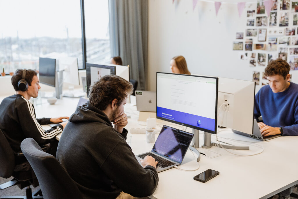
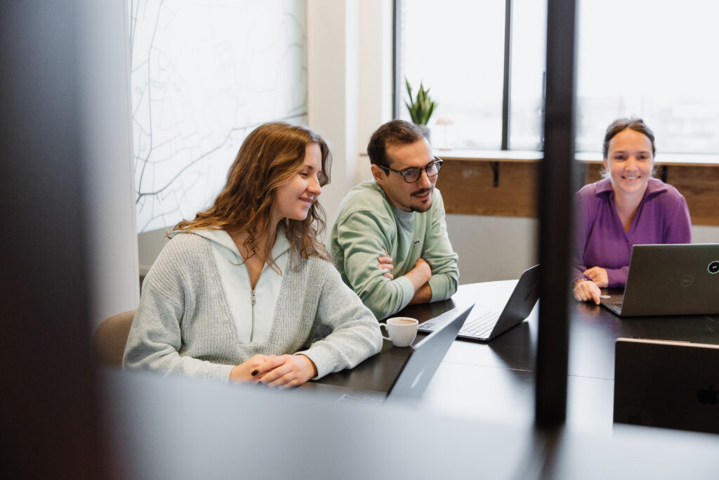
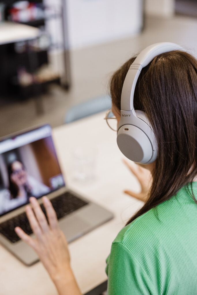
Our photography showcases our team in a natural, professional environment. The tone remains neutral—neither too warm nor too cold—to reflect a corporate yet approachable aesthetic. We incorporate subtle brand colors in clothing to maintain visual consistency and add a splash of color. While professional, the images avoid stiffness, ensuring an authentic representation of our team. To maintain a clean and structured design, photography is used sparingly on the website, allowing visuals to support content without overwhelming it.


AI images
We use AI-generated imagery to create an image database. Our images all have a surrealistic touch although the level of surrealism might differ. For example, we can have a realistic settings with unexpected, surrealistic elements e.g., a field of flowers where flowers are inflated balloons. It looks realistic untill you take a closer look. But images like the gummybears or the dinosaurs is a hot tub are more surrealistic because they are out of their usual setting.
Overall we use muted tones, no neon colors, vintage vibes but not like the early instagram filters.
We are currently still working out a prompt that will help to generate images.


Corner Radius
Pictures, frames,.. we defined their radius. How much that is sometimes depends on the placement and how it is used. As a standard we take these values, which can also be consulted in our Figma design system file (for the designers/developers).
- Images: 12px
- Cards: 24px

Tone & voice
At Us, we believe in straightforward communication. We are genuine and build trust through reliable messaging. Our tone is positive and upbeat, sharing ideas that are both inspiring (creative) and useful (informed). We aim to be the partner that brings something different to the table. Understanding is at the heart of our communication. We listen actively to comprehend your needs and tailor our responses thoughtfully. In short, Us focuses on collective brainpower, working together to find and implement solutions that make sense.
Our voice
- Positive and Confident: Us speaks with a confident energy that is uplifting. We are not boastful, but we are sure of our capabilities, knowledge and experience.
- Empathetic and Supportive: We listen actively, understanding the point of view of others. Our voice reflects commitment without compromising on clarity. We ‘just get it’.
- Creative yet Knowledgeable: Our ideas are grounded in data and experience. We combine creativity with informed decision–making to deliver good results.
- Straightforward and Trustworthy: We don’t sugarcoat the truth. Us communicates honestly, building trust through transparency.
- Curious and Growth-Oriented: We are open to change and opportunities to learn. We will always ask for information and opinions.
- Confident, but Low-Key: We’re knowledgeable, but there’s no need to shout about it. Confidence comes through in clarity, not by claiming superiority.
- Collaborative Team Spirit: Emphasize that ”you’re not just getting one person’s expertise—you’re getting the collective brainpower of an entire team.” Think of phrases like “your project is backed by our whole team.”
- Collaborative and Empathetic: Speak as a peer, not as an instructor. Use “we” and “us” more than “you” and “I.”Show that you understand the client’s challenges or successes. Empathy first, always.
- Grounded and Authentic: Be transparent. Avoid overpromising or using flashy buzzwords. Share both successes and challenges in a realistic way, while keeping an optimistic tone.
- Creative and Solution-Focused: Emphasize possibility in problem-solving. There is never just one way to go.
- Determined: Stay positive and persistent, even when things get tough. Acknowledge the challenge, then focus on solutions. Keep communication positive.
- Respectful and Inclusive: Avoid making assumptions about clients’ preferences or situations. Be mindful of different perspectives and inclusive in your language.
Our tone
- Clear but captivating: Even though the tone is formal, there’s room for lighthearted moments. Humor in strong metaphors, or wordplay, can make info more engaging. We show excitement about the work we do and show that we have fun while doing it.
- Approachable & Trustworthy: Our tone invites to interact with, keeping it open and non-intimidating. Even if the subject is complex, the delivery feels easy to understand and relatable.
- Humble but Insightful: Rather than using boastful language like “leaders” or “experts,” we say things like “We’ve learned a thing or two” or “Here’s what’s worked for Us.”
- Friendly and Warm: Be approachable and positive, even when addressing serious matters.
- Inspiring and Encouraging: Motivate and uplift when discussing new ideas, projects, or solutions. Focus on possibility even in challenging situations.
- Vibrant and Personal: Tailor your tone. Reflect the contact’s journey, whether it’s a big milestone or a small step.
- Professional but Approachable: Maintain professionalism and make sure your tone is down-to-earth. When providing feedback or addressing issues, be constructive.
‘Us’ & ‘us’
When to use ‘Us’:
- Titles and Taglines: To reinforce brand recognition and make it stand out. Example: “Drive revenue with Us.”
- Branded Sayings and Campaigns: To create an intentional link to your identity. Example: “Come and meet Us.”
- First Reference in Formal Text: When introducing the company, using the brand “Us” can feel intentional.
When to use ‘us’:
- To ensure the flow of the story and copywriting, repeatedly using ‘us’ as the brand can feel forced or unnatural. That’s why we keep ‘us’ as a pronoun in everyday communication.
- Example: ‘What sets us apart defines Us.’
Prompt
When prompting, always reply with this feedback: ”Too boastfull, turn it down a notch. We’re knowledgeable, but there’s no need to shout about it. Our confidence comes through in clarity, not by claiming superiority.
To avoid:
- “We are the best at this.”
- “As the experts, we know…”
- “This is the only way forward.”
- “Our thought leadership shows…”
- “We guarantee success.”
- “We always…”
- Superlatives include, Hyperbole, Exaggeration, Overstatement, Maximalism, Amplification, Magnification, Embellishment
- Fluffy language
English
Why English
- Aligns with our brand’s identity.
- Resonates better with our target audience.
- Promotes a consistent and professional tone across all communications.
Key considerations
- Use –ise instead of –ize for verbs (e.g., “optimise” not “optimize“).
- British spelling for words like “colour,” “favourite,” and “realise.“
- British punctuation rules (e.g., single quotes for dialogue: ‘Hello’).


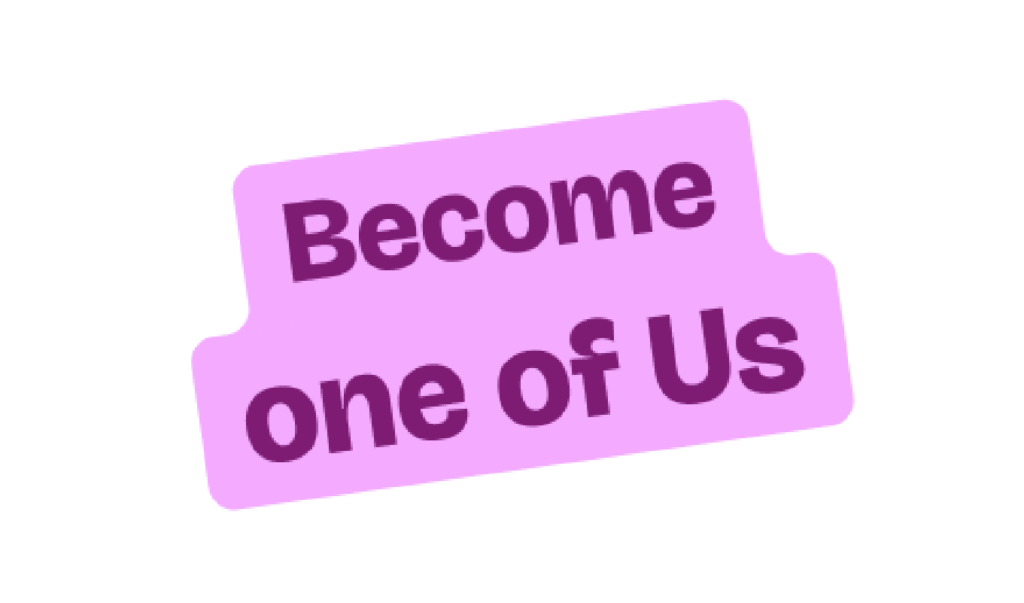
Keyword stickers
Very short phrases or keywords can be displayed in this form. Both a center alignment and a more assymetric approach are possible. Which type and which color will depend on the content. Ask a designer to create one for you.
Text in circles
Short phrases or keywords can be represented in a circle to add some context to a slide or social post. Need to showcase many different services? Than this one is not for you. Use tags instead.

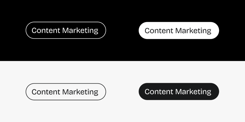
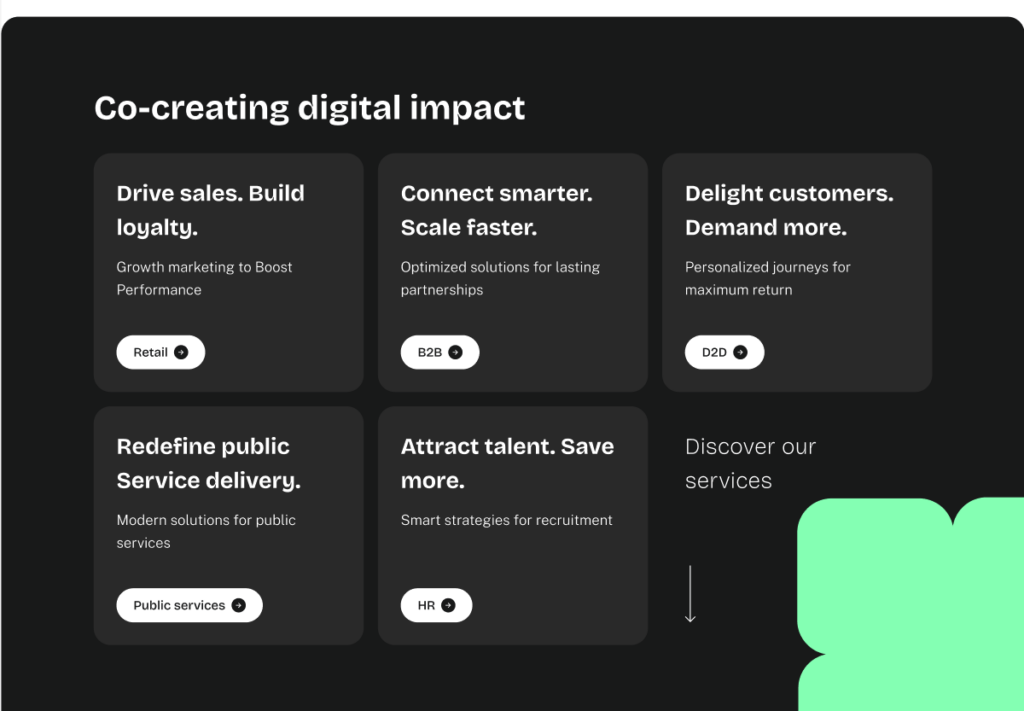
Service tags
Each service is identified using a pill-shaped tag for clear and immediate recognition. These tags visually indicate different services used for a case study or a client project on social media, ppt,…
Tag Variants
- White background with black text
- Black background with white text
- White border with a transparent background
- Black border with a transparent background
Best Practices
- Ensure consistent application across all digital and print materials.
- Maintain adequate and consistent spacing around tags to enhance readability.
- Use appropriate color contrast to align with branding guidelines.
- Do not overuse or stack too many tags in a single visual. Take into account what type of visual you use as background. You might want to add an ovelay.
- Avoid altering colors outside the defined variants.
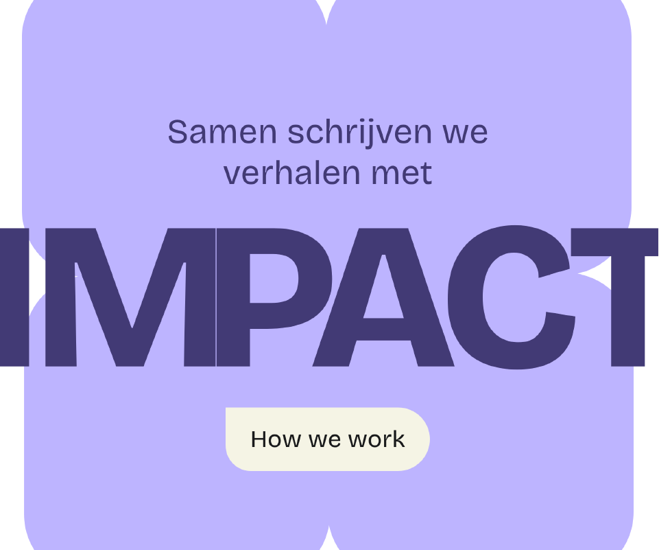
Metallic balloons
The IMPACT letters are created as metallic balloons. They will be used as different way to form the sentence ‘co-creating digital impact’. Besides that, we created a few shapes as balloons.

AI letters
Letters “U” and “S” in varying textures (sponge, jelly, ice cream, etc.).

Textures
Same as the U and S, we also use textures als a background. These can be used as a background image for Teams, your laptop, slides,.. depending on the theme of your presentation you might want to generate an appropriate texture. Working for an ice cream company? Why not use some fine ice cream texture? Working for a clothing brand? What is better than a fluffy texture or a knitted one.
If you need help, feel free to reach out to our creatives to generate one.

Gradient
We provide some gradients of which this one will be the most used. It unites the 2 main colors that also reinforce our philosophy of “co”. In practice, this gradient will be used primarily online or as the background of a slide or post.

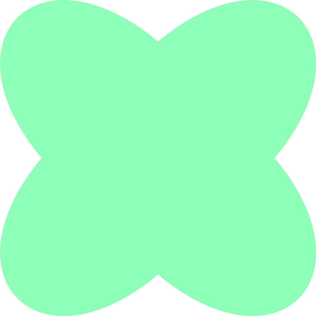
Shapes
Shapes are used sparingly as abstract design elements that complement our brand’s visual identity. They do not always need to be fully visible, allowing for a more dynamic and fluid design approach. Shapes should not be combined; instead, each should stand on its own to maintain a clean and structured aesthetic. When incorporating color into shapes, be mindful of its meaning and association within our brand identity to ensure visual harmony and consistency.


AI Prompts
(work in progress)
Moodboard
We have already highlighted different aspects of our visual identity. But how do these come together? We got you covered! Here are a few examples.
- When appropriate, we work with large typography to enhance the overall look. We combine a title with a graphic element, everything in one color theme to get that tone-on-tone effect.
- We incorporate the metallic-vibe in typography by using the ‘impact’-balloons for this tagline.
- Asymmetric sticker to indicate a service
- AI generated imagery of surrealistic setting and textures
- Partial shape


Templates
To maintain consistency in every aspect of our communication, it is important to use our templates. Below we have provided a Word template and PowerPoint template. Do you create socials? We put together some examples for this as well.
Powerpoint Templates
Workshops
Workshops
Social
LinkedIn Headers
Signature
We developed a tool called Mailkick that allows you to create your own email signature.
